Showing posts with label embossing. Show all posts

Friday, September 4, 2026

Merry Christmas Cardinals

The August challenge at Christmas Card Throwdown is to make a fractured card. Usually (at least from what I can tell), the strips on this card design are solid cardstock with patterned paper in the background. I wanted to do things a little differently, so I pulled out some old-ish cardinal washi tape that I got a few years ago at Paper Source. Because it's translucent & I wanted it to stand out a bit, I adhered lengths of the washi to a couple of scraps of white cardstock & trimmed the cardstock to the same width as the tape.


At first I was thinking of using solid cardstock for my background, & maybe having each section be a different color. I also considered using an embossing folder to add texture. Because the washi tape is about 9/16" wide, I needed a larger card to implement my idea. So I went with a 5x7" card. This ruled out a lot of my smaller (~A2 size) embossing folders. And the multi-color approach just seemed a bit too fussy. So I decided to stamp a subtle background with the "Holly's Snowflakes" set from Mama Elephant (discontinued). (I just couldn't leave the background too plain! 😆)The grey branches against the white background in the washi design inspired me to stamp with white pigment ink onto a light grey cardstock, for kind of a reverse effect. The white ink kept the stamping subtle while still adding a little interest.
 
For the focal image, I chose the single cardinal from Hero Arts' "Holiday Cardinal" stamp set. I stamped it on a scrap of Strathmore smooth bristol paper with Versafine Clair Nocturne ink & heat embossed with clear powder. Originally, I die cut that with a Waffle Flower "Additional Squares" die & painted the bird with my Zig Clean Color Real Brush markers. However, I couldn't come up with anything for the bird to stand on, & I didn't want him just "floating" on a white background. So I thought of having him stand on a greeting strip. But short of cutting around just his feet with a craft knife & slipping a strip into that slit, I couldn't figure out how to accomplish that. So I ended up die cutting him with the coordinating die so I could easily tuck the strip underneath his feet.
 
I stamped the greeting, also from "Holiday Cardinal," onto a scrap of white cardstock, & cut it into a banner. I glued that onto another layer of cardstock, to make it a little sturdier, then cut around it.
 
I die cut another square for my diamond from a scrap of blue parchment paper. I adhered that to my card front, centered side-to-side but a little up from the horizontal center of the card. I adhered my washi tape strips around the diamond, cutting the ends around the edges as I went. Finally, I glued down my greeting strip & glued the bird "standing" on top of that. Even with the journey this card became, I am in love with the final result! I'm sure the recipient will love it as well.
 
I'm also entering my card in the following challenges:
 
The Paper Funday Challenge #91: "Anything Goes" (not playing the optional twist) 

Monday, May 11, 2026

Masculine Happy Birthday

 
I am so excited to be the Crazy Cousin guest designer for the Double Trouble Challenges this month! Challenge #216 runs from May 11-24. "It's a Wheelie Cool Day" for this challenge, where you need to use 3 layers (card base does not count), 2 shapes, & 1 image. While you're certainly free to do more than that, those are the minimum requirements to play. And of course, there is always the optional sketch challenge starting tomorrow at Try a Sketch on Tuesday. (Please keep in mind, the TSOT challenge doesn't start until May 12, so if you want to enter there, you cannot post, publish, or enter your project online before then!)
I created this card for a friend's birthday. Thing 3's optional twist for Double Trouble is to use something with at least one wheel, cam, and/or gear. While I have images like trucks, a scooter, & even gear dies, I decided to think a little "outside the box" & used Doodle Pantry's "Watermill" digital image (discontinued), which features a millwheel. I thought this would make a good masculine card.
 
After sizing the image in Photoshop, I printed it onto a piece of Canson XL watercolor paper with my laser printer. I then painted the scene with my watercolors. That was a bit of a challenge to get it to look right, but I think I prevailed. For the finer details, like the fence, millwheel framing, & the supports under the projecting part of the building, I used a few of my Prismacolor colored pencils. These were really tiny elements, & it was just easier to get in with a sharp pencil than a paintbrush.
 
Once the painting was done & dry, I die cut it with a "Nesting Oval Infinity" die from Hero Arts. Since I wanted a narrower mat than I would have gotten by cutting with the next larger die, I had to get a bit creative. As an extra personal challenge to save on cardstock, I first cut out all but a 3/8" border from a navy A2 panel. I traced the outer edge of the oval die onto the piece I'd cut out. Since I knew I wanted to do the same for the greeting, before I cut the large mat out, I went ahead & traced around the smaller die in the middle of the larger oval outline. To make accessing the smaller oval easier for cutting, I cut a rectangle around that outline with my craft knife & a metal ruler. Finally, I used scissors to cut out each oval. The parts I gutted from the two larger mats are covered, so no one would know they're "hollow." Even better, I got 3 mats out of one A2-size panel - score!
 
I stamped the greeting in Scorched Timber Distress Oxide ink onto a scrap of light blue cardstock & die cut it with a Waffle Flower "Nesting Ovals" die. Then I glued that & the image oval to their mats. I embossed a panel of kraft cardstock with Honey Bee's "Wood Planks 3D" embossing folder, trimmed it to 3-3/4 x 5", and adhered my image & greeting ovals to that. I cut off the overhanging bit of the greeting oval, then adhered my panel to the navy mat/border that I'd adhered to a white A2 card base. I cut 3 banners from patterned paper scraps in my stash, & glued just the top portion of each to the card front, so the ends are free.
 
I really love how this card came out! Filling all the challenge requirements was, well, a challenge, but it was so worth it in the end. I'll see y'all again in a couple of weeks for my next guest design post, if not sooner! 


 I'm also playing along in Try a Sketch on Tuesday's Challenge #695

Friday, April 3, 2026

Have a Joyful Christmas

This week's challenge theme at Christmas Card Throwdown is "Slimline Card." I don't normally do slimline cards, but I decided to have a go at it for this challenge.


I went with a portrait slimline card, so I cut a piece of 110 lb. white cardstock to 8-1/2x7", then scored at 3-1/2" along the shorter side & folded that in half to create my card base. I cut a piece of Strathmore smooth bristol paper to 3-1/4x8-1/4", so I would have a narrow border on all sides of my panel once I put it on my card.
 
I stamped 5 of the images from Hero Arts' "Christmas Crystals" set (discontinued) onto my bristol panel, making sure to get them perfectly vertical. While this card is not exactly what I'd call clean & simple, I do consider it minimalist, so having my images lined up just right was important for me. I heat embossed the crystals with Wow White Pearl embossing powder. Because 2 of the crystals overlapped 2 others, I first heat embossed the larger ones, let that cool, then placed the panel back into my MISTI. I positioned the other crystals, stamped them with clear embossing ink, & heat embossed them. I think it actually worked quite well in the end! 😊
 
After I had heat embossed all my crystals, I used my Zig Clean Color Real Brush Pens to color them. I used just one color per crystal to keep things simple. I outlined a section with my pen, then used a wet paintbrush to spread the color towards the middle of that section. I did that one section at a time so the ink would still move freely. (I have found that if you let the ink sit long enough - even on bristol paper - it will set & won't move as easily.) For the crystals that overlapped, I made sure to use colors that wouldn't create mud. I applied the lighter color first (yellow & pink), & then painted in the darker color. I love how it looks like one crystal is shining through the other where they overlap - just as I had planned!
 
When I finished adding color to all the crystals, I had to figure out a greeting. After much playing around and hemming & hawing, I decided to use the "Joyful and Merry" stamp set & coordinating die set by Kristina Werner for Concord & 9th.
 
First, I die cut the Joyful from a scrap of bristol paper. I taped the word back into the negative space for support, & used my yellow & green brush pens to create a gradient of color over the word. Once the ink had dried, I removed the word from the negative & ran it through my Xyron machine to apply adhesive to the back. (Even after the ink dries, liquid glue can reactivate it, so I definitely wanted to stick to dry adhesive for this card!) For the supporting greeting strips, I heat embossed the words onto another bristol scrap, die cut them with a "Sentiment Strips" die from Pretty Pink Posh, and colored each strip with my purple brush pen.
 
I lightly tacked down the Joyful die cut to my panel, just to hold it in place while I worked. I positioned the upper greeting strip, & marked the edge of the "f" on the strip where it crossed. I cut that contour with my scissors, & adhered the strip with double-sided tape, tucking the cut end under the "f." There was a little hanging off the left side of the panel, so I just cut that off with my scissors. I repeated the process with the other greeting strip, curving the left end along the descender of the "y."
 
For the hangers on the crystals, I poked a small hole at the top of each one. I threaded a length of fine silver thread through each hole, wrapped it around the top of the panel, & taped both ends on the back.

I decided to double-mat my panel with silver foil & Midnight Navy cardstocks, both from Recollections. I first adhered my panel to the silver, and used one of my Perfect Paper Layers rulers (discontinued) with a craft knife to cut around the panel. This allowed me to get a perfect 1/16" mat. I cut my navy panel to 3-1/2x8-1/2" and adhered it directly to my card base. I added the matted panel, & that finished this card.
 
I had considered adding Glossy Accents or clear embossing powder over the crystals for extra shine. But I was afraid it might ruin the shading & highlights I had worked so hard to get by making the ink on each crystal a solid muddle of color. So I decided to quite while I was still ahead. 😉
 
I'm also entering my card in the following challenges: 

Monday, March 23, 2026

Happy Birthday


The current challenge at Seize the Birthday is, as always, "Anything Goes" (as long as it's a birthday card). But the optional topping this time is using green as the main color. I must admit, it was a bit of a struggle for me for some unknown reason. But I pulled out some of my green Distress inks & went to town! I think I came up with a pretty cool birthday card, if I do say so myself (& I believe I just did say so! 😁). 
 

For the postage stamps, I pulled out an older set, "First Class" from the Essentials by Ellen line (discontinued). Even though I have had this set since before Ellen Hutson closed their online store (maybe a few years ago), I have never used it. I came across it (again!) in my bin of unused products & decided I finally had to do something with it. So I pulled out several of the stamps & heat embossed them with Ranger Silver Super Fine Detail embossing powder onto a large scrap of Canson XL watercolor paper.
 
I used painter's tape to mask off the outer part of each stamp, & ink blended the inside portions. Like I said, I used some of my green Distress inks for most of the stamps - in keeping with the challenge topping - but also pulled in Shaded Lilac & Salvaged Patina for accent colors. On the 2 stamps with flowers, after I had ink blended, I used a wet paintbrush to "paint" over the blossoms with clean water, then picked up the water & ink with a dry cloth. This bleached the color slightly for a subtle two-tone effect. (I learned this technique in Juliana Michaels' recent "Stretch Your Stamps" class.) Finally I cut my postage stamps out with scissors, leaving a 1/16" border around each.
 
I used the largest of the "Scallop Rectangles" die set from Pink & Main for the mat. I cut it from mint green cardstock & ink blended from the bottom to about 2/3 of the way up with Cracked Pistachio Distress ink to give a subtle ombre look.
 
Then I positioned my stamp images onto the panel. This was actually probably the most time-consuming part - just trying to make everything fit AND look like a balanced composition. I finally got an arrangement I liked. There was a large-ish gap under the top floral postage stamp, though, so I decided to cut some small banners from patterned paper scraps to come out from under that stamp to fill the space. Once I had those tacked down to the back of that stamp, I glued all my postage stamps to the mat panel with liquid glue. In hindsight, I wish I had glued the purple stamp sideways, just to echo the top left stamp, but I didn't think of that until after the glue had dried, so it is what it is. I don't hate it, but I just think it would have looked even better.
 
After the glue had dried on all of my stamps, I added my scalloped panel to a green cardstock mat that I'd adhered to a white landscape A2 card base. I'm sending this card to Kristina Werner for the March Mail Call video next month, where the theme is ink blending.
 
I'm also entering my card in the following challenges:
 

Saturday, March 14, 2026

Happy Easter


The sketch for Try a Sketch on Tuesday's Challenge #690 inspired the design for my card. I basically followed the sketch to the letter, though I did substitute a leafy cluster for the smaller background hexagon.
 
 
I began with the cross panel. After I die cut the mat, using an Elizabeth Craft Designs "Stitched Indented Rectangle" die (discontinued), I die cut the panel from Canson XL mixed media paper with a Hero Arts "Rounded Rectangle Infinity" die to fit inside the mat. I determined the proportions of both parts of the cross, & cut 2 pieces of yellow Frog tape to those measurements. I lightly penciled the position for the tape pieces to center them on the panel, & adhered them on those marks. I made sure to burnish them well to the paper, as I did NOT want them to lift up & let ink underneath. (Spoiler alert: that happened.)
 
One of the palettes from Sarah Renae Clark's Color Cube system (old system version palette #342) inspired my ink color choices. For the ink blending around the cross, I took a cue from this image I found on Pinterest. I used a small ink blending brush to go around the whole cross with Tumbled Glass Distress ink to give me a base color. Then I added in bits of Peeled Paint, Stormy Sky, & Broken China Distress inks. After I had what I felt was a good balance of colors, I peeled off the tape masks. Unfortunately, ink had "leaked" under the tape in a few small spots, but that was nothing that a white gel pen couldn't cover up - shhhh! 😉 I adhered the main panel to the navy mat, & set that aside.
 
For the image hexagon, I used Deep Red's "Lily Blossom." This is a stamp that I have had for a loooong time! I don't use it that often, but it seemed perfect for this card. I stamped it onto Strathmore vellum bristol paper with Altenew's Vanilla Cream ink, then die cut it with a We R Makers "Nesting Hexagon" die (discontinued). I wanted a soft color, but not quite as pale as for "no-line" coloring. I used my Prismacolor colored pencils to color the leaves & add shading to the flower petals. To help it stand out a bit, I inked around the edges of the hexagon with Stormy Sky Distress ink.
 
I pulled out another oldie-but-goodie stamp - Stampabilities' "Happy Easter 2016" (discontinued) - for the greeting. I heat embossed it on another scrap of mixed media paper, & inked over it with Tumbled Glass Distress ink. I blended on some Stormy Sky to the bottom for an ombre effect. After I did that, I realized I may have made a bit of an error in judgment. When I fussy cut (as I was here), I like to outline the greeting or image lightly in pencil first, to give myself a guideline to cut on. (I picked up this tip from Kristina Werner.) But I was afraid that, when I went to erase any errant pencil marks I might have, I might erase the ink as well. After thinking about it for a moment, I decided to see if my Frixion heat-erasable pen would work. So I tried it on a section of the paper that I knew I would cut away, & it worked like a charm. All I had to do was hit it with my heat gun & the ink disappeared without leaving a trace. Whew! So I outlined the greeting with my pen (leaving a little extra room around the greeting than I normally would) & then cut just inside those lines. Even cutting inside the lines, I did have a few pen marks in the end I didn't cut off, so I just erased them with a shot of hot air.
 
I die cut the leaves from mixed media paper with the smaller die from Simon Says Stamp's "Etched Laurel Leaves" set. I wanted a soft green that kind of matched the leaf color I'd achieved in the lily image. It turned out Cracked Pistachio Distress ink was a good match, so I added some of that to my non-stick craft mat, spritzed with a bit of water, & ink smooshed the die cut leaves. I dried that with my heat gun, & repeated a couple more times for the depth of color I wanted.
 
Finally it was time to assemble the card. I found a piece of patterned paper in my collection that had a very faint (as in almost imperceptible) yellow check pattern. I cut that to the full 5x7" card size, & adhered that to my white card base. I adhered the matted cross panel next. I decided where exactly I wanted the hexagon, & used that to help me position the leaf cluster, which I tacked down with a few drops of glue, leaving the tips of the leaves free. I glued down the hexagon, & then the greeting. I had to add a few bits of cardstock behind parts of the greeting, since it overlapped the various layers & so wouldn't otherwise lie flat. I am so pleased with how this card came out! My mom will send it to a priest friend of hers, who I hope will like it just as much.
 
I'm also entering this card in the following challenges:
 

Friday, February 27, 2026

Aged to Perfection


I created this card for my uncle for his birthday. I based the design on the sketch at the current "Try a Sketch on Tuesday" challenge. I kept to the sketch pretty closely, but stretched the width & shortened the height of the overall design. I also matted the patterned paper strips panel.
 
 
I began by creating my background. I decided on a 7x5" card with a 1/8" mat on all sides. That left me with a total of 6-3/4x4-3/4" to cover. I cut 3 patterned paper strips from my scrap stash to 2-1/4x4-3/4", & embossed each with the "Tumbled Hexagons" embossing folder from Simon Says Stamp (discontinued). I chose those particular patterned papers because of the somewhat muted, masculine rainbow colors. The music piece is especially meaningful because my uncle does karaoke performances for senior centers & other groups.
 
I inked the edges of each strip with Faded Jeans Distress ink, just to define them a bit more. Then I adhered all 3 strips to a slightly smaller panel of white cardstock, just so I could work with them as one piece. I did have to trim the strips a bit, just to size them & square them better. I matted that with a teal cardstock panel that I adhered to a white card base.
 
The truck and greeting are both from Doodle Pantry's "Hotrod Pickup 1" digital set (discontinued). I sized the truck in Photoshop, then printed it onto a panel of Canson XL watercolor paper. I waited to finish working with the greeting, since I didn't know at that point what size or color of panel I wanted.
 
I painted the truck with my watercolors, then rounded the corners of the panel with the 1/4" side of my We R Makers Corner Chomper. (I felt the rounded corners complemented the curves in the truck well.) I inked the edges of the panel with Faded Jeans ink to tie it in with the background. I used a combination of double-sided tape & liquid glue to adhere it to my card front.
 
I ended up printing the greeting on a 2x1" strip of light teal cardstock. I rounded the corners of that as well & inked around the perimeter with Faded Jeans. I added a few scraps of cardstock to the back where it overhung the image panel so it would lie flat on the card front. I glued the strip in place, & that finished this card.
 
I'm also entering this card in the following challenges:
 

Friday, October 31, 2025

Two Cards - One Hour

 
Christmas Card Throwdown's Technique challenge this week has been "Quick Card." Basically, make a card in 30 minutes or less. Sounds easy, right? Well, suffice it to say my first attempt went over the 30 minutes by about 25 minutes more. Thankfully, I was able to scale back & get not just one, but 2 cards that meet the time constraint!
 

For my first card, I pulled out an oldie but a goodie - "Lovely as a Tree" from Stampin' Up (sadly discontinued). I began by cutting a white cardstock panel to 7x5". I used yellow Frog Tape to mask off the edges, leaving a rectangle in the middle. Then I stamped one of the images with Simon Says Stamp's Mint Candy ink. I wanted a misty appearance, inspired by this card, & this light green fit the bill quite nicely.
 
Without removing the tape, I ink blended in the center rectangle with Bundled Sage. Cracked Pistachio, & Iced Spruce Distress inks. I added extra Iced Spruce around the edges to darken them slightly for a vignette effect. Then I carefully removed the tape, being sure not to peel any of the cardstock up.
 
I stamped the pine tree from the same set off to one side with Simon Says Stamp's Laurel Green ink. I actually stamped it twice (thank heavens for the MISTI!) to get a slightly darker impression. I stamped the greeting, from WPlus9's "Poinsettia Bouquets" (discontinued) in that same color. For the snow on & under the tree, I daubed embossing ink on with a Distress embossing pen, then sprinkled Hero Arts' White Puff embossing powder over that. I brushed off some of the powder, as I'd gotten a bit heavy-handed with the ink, then melted what remained with my heat gun. Finally, I adhered my panel to an A7 card base.
 

 The inspiration for my second card came from this card by Chari Moss. I liked the glittery greenery & the simple CAS design.
 
I die cut the greenery & berries, from the Essentials by Ellen "Poinsettia & Pine set (discontinued), from green & red glitter cardstocks. For the background, I pulled an A2-size cream cardstock panel from my pre-cut card fronts stash. I stamped the greeting, from the Essentials by Ellen "Mistletoe & Holly" set (discontinued) in Candied Apple Distress Oxide ink. Again, my MISTI came in clutch, since I had to stamp it a few times to get a good impression. I trimmed the panel down to 4x5-1/4", and matted it with a dark brown cardstock that I'd adhered to a white A2 card base. I glued my greenery & berries at the top of the panel. I added the glue only to the stems, so the die cuts kind of "hang" freely. Finally, I tied a triple bow from gold DMC Diamant thread & adhered it to the top of the greenery. I don't normally do something this "bare," but I really like how it came out!
 
I'm also entering my first card in The Paper Funday's October "Anything Goes" Challenge (not playing the optional twist).

Friday, September 19, 2025

Peace

 
This week's challenge at Christmas Card Throwdown is to use the colors teal & silver. Small amounts of black &/or white are allowed, but the primary colors need to be teal & silver.


I began by heat embossing the large background image from WPlus9's "Joyful Poinsettia" stamp set (discontinued) in silver onto a panel of white Hammermill 100 lb. cover weight cardstock. I love this particular cardstock for stamping and ink blending, as it is very smooth & not overly absorbent. Once I melted the embossing powder & let it cool for a few seconds, I ink blended over the entire panel with Salvaged Patina Distress ink. Then I went around the sides with Mermaid Lagoon Distress ink, not going all the way to the center so there would be a bit of a "glow" effect from the Salvaged Patina. Finally, to up the drama & contrast, I ink blended just around the edges with Uncharted Mariner, which is a deep teal blue color. I did a little more blending with Salvaged Patina, just to smooth the transitions among the 3 shades, & then wiped off any ink sitting on the embossing with a dry cloth.

I had a leftover peace die cut (made with a discontinued die from Winnie & Walter) sitting on my desk from a previous project It was white, but I thought it might work for a greeting if I die cut it from silver metallic cardstock. Not to let anything go to waste, I decided to layer the silver word with a couple of white die cuts, just for a bit more dimension. So I die cut the peace from Recollections Silver Foil cardstock & a scrap of white cardstock, & glued all 3 layers together.

To finish my card, I adhered my emboss-resist background panel to a white A2 top-fold card base. Then I glued the layered peace die cut on, centered on the panel. I considered adding some sequins or something, but decided to leave it as-is.

I'm also entering my card in the following challenges:

Paper Funday Challenge #80: "Anything Goes" (not playing the optional twist)

Friday, August 15, 2025

Happy Holidays Ornaments


This month's color challenge at Christmas Card Throwdown is "Baby Blue, White, & Light Brown." I had gotten the "Holiday Ornaments" stamp set by Pretty Pink Posh several months ago, & it's been lying on my desk ever since, waiting for me to use it. I thought this was the perfect occasion to break it out.


I decided to use Gansai Tambi Pearl Colors watercolors to paint the ornaments, just to give them a little extra pizzaz. I stamped them on Strathmore mixed media paper & painted them with the blue & white paints in the set. I had to water down the blue quite a bit to get it to the right value, but it worked out great in the end. After the paint dried, I noticed that parts of the white areas seemed a bit dingy when I looked at them at certain angles, so I went over those areas with another layer of the white pearlescent watercolor. That improved things. The problem might have been different thicknesses of the paint layers catching the light oddly. At any rate, after the paint had thoroughly dried, I fussy cut each ornament with my scissors & poked holes through the ornament hangers.

I die cut a panel of light kraft cardstock with one of the "Stitched Indented Rectangles" from Elizabeth Craft Designs (discontinued). After putting white metallic thread through the ornament hangers, I glued the ornaments in place on my panel. I folded the thread ends to the back of the panel & adhered them in place with double-sided tape. After the glue dried thoroughly, I heat embossed my greeting, from Honey Bee Stamps' "Pretty Poinsettias" stamp set (discontinued). Finally, I adhered my panel to a white A2 card base.

I'm also entering my card in the following challenges:

Monday, July 21, 2025

Happy 30th!


A friend's daughter turned 30 this past weekend, so she commissioned me to make a special card for her. The main element she wanted me to include was a Rottweiler image colored to look like her daughter's dog, Mocha. She sent me several photos of Mocha for reference for her colors & markings, & I found a Rottweiler coloring page that proved to be perfect for this card.

I first printed the coloring page, since it was a pdf file & I wanted to make it a resizable image file. I scanned the printout into my computer, & opened it in Photoshop. I created a blank "canvas" in Photoshop, sized to 4x5-1/4", which would be the final size of my main panel. I used that to help me resize the dog image. I used a greeting from Dreamees, from a CD that I'd gotten in a papercrafting magazine several years ago. I positioned & sized the greeting on my canvas in Photoshop to work with the dog. Once I knew what size I wanted the dog, I created another blank canvas & moved the image to that so I could print just the dog onto a panel of Strathmore vellum bristol paper.

I colored the dog with my Prismacolor pencils, referencing the photos of Mocha my friend had sent. Thankfully, it wasn't hard to get the markings & colors right. After I finished coloring, I fussy cut it out.

For my background, I wanted to create a little scene with a light blue cloudy sky. Because the ink in my printer smears if I ink blend over it with Distress inks, I needed to add my stenciled clouds before I printed the greeting. So I cut a panel of Canson XL mixed media paper to my panel size, & ink blended the clouds on the upper portion with Tumbled Glass Distress ink & the "Cloud" stencil from My Favorite Things (discontinued). (My camera couldn't pick up the stenciling because it's so faint, but it does show in real life.) After I finished stenciling the clouds, I printed the greeting at the top of the panel. To add a finishing touch, I used a blue Tombow marker to color in the outline "fabulous" letters & a pale purple for the butterfly.

I die cut a few grass layers with the "Grassy Hillside Borders" dies from Lawn Fawn for my foreground. I cut another layer with Picket Fence Studios' "A2 Tall Grass" die (discontinued). I added the layers to the bottom of my panel, situating the dog's feet within the layers to make it look like she was standing in the grass, rather than just on top of it.

I wanted to make number balloons like the fancy ones party shops sell. I found the "Balloon Dreams" font on dafont.com, & used that to type a 3 & a 0 in Photoshop. I sized the numbers, & added a triangle to the base of each, which I "drew" with Photoshop's Shape tool. I flipped my "balloons" horizontally so they would print backwards, & printed them onto plain copy paper. (By printing them reversed, I could adhere them to the back of my cardstock & they would be correct when I cut them out.) I roughly cut around them & temporarily adhered them to the back of a scrap of gold mirror cardstock. I fussy cut around each number, & then removed the paper templates.

I die cut several balloons from rainbow colors of cardstock with the "Birthday Balloons" dies from My Favorite Things (discontinued). I applied embossing ink to the front of each, & coated them with Ranger Clear Super Fine Detail embossing powder. I repeated this 2 more times. In hindsight, I'm kind of sorry I went that route. I wanted shiny balloons, but by the time I'd glued them to the card, the heat embossed layers were a bit crazed & dull, rather than clear & shiny. I could have used Glossy Accents in the first place, but because the balloons were so small, I wasn't sure how I could manage & not have them look like one huge balloon, or get messed up somehow if I added it before gluing them to the card. But, they're really not that bad, & since they're in the background, I just left them alone. I did adhere the end of a piece of crochet twine for a balloon string to the back of each balloon before gluing them to the card.

After I glued the regular balloons, I glued the number balloons down on top of them. I was able to use Glossy Accents on those without messing anything up, to make them a bit more dimensional & shiny. Then I set the card aside overnight to let the Glossy Accents dry thoroughly.

I die cut a balloon holder from Recollections holographic cardstock with a die from My Favorite Things' "Party Decor" set (discontinued). To gather the balloon strings behind it, I first punched a 1/16" hole where the holder would cover it. I threaded the ends of the strings through the hole & taped them to the back of the panel. Because the gathered strings created a little bulk on the front, I added the balloon holder with a small foam dot to make it even with them & glued the top of the holder directly to the strings to keep it from flipping up. Finally, I matted the panel with blue cardstock that I adhered to a white A2-size card base.

I'm entering this card in the following challenges:


Paper Funday Challenge #78: "Anything Goes" (playing the optional "Fun with Stencils" twist)

Happy Birthday #60


A friend commissioned me to make a birthday card for her husband. He is a woodworker, so she wanted a woodworking theme of some sort. I couldn't find any woodworking imagery per se (e.g. tools) that really worked for a birthday card, so I incorporated other elements.

For design inspiration, I perused my Pinterest board I have saved birthday cards on. I found this one, & liked the overall layout & how the greeting ran vertically rather than horizontally. So I decided to go that route.

I began with the balloons. I die cut the large balloon with a "Nesting Balloons" die from Paper Rose from cherry wood veneer paper that I've had in my stash for years. I die cut "60" from the balloon with the "Little Numbers" from My Favorite Things (discontinued), as the recipient was turning 60. I also die cut the numbers from gold mirror cardstock. I backed the balloon with kraft cardstock, & inlaid the numbers. I made sure also to add the inside bits of the numbers that had been die cut from the wood paper. For the 2 cardstock balloons with a woodgrain pattern, I first die cut the balloons, and then stamped the woodgrain with a slightly darker color ink, using the "Tree Ring Background" stamp from Concord & 9th. I cut another balloon from a plaid paper from Recollections, & a fifth from an inky technique piece that's been sitting on my desk for ages. I tied a string around the neck of each balloon, and set them aside while I worked on the rest of the elements.

For the presents, I decided to make them look like blocks of different species of wood. For the maple block, I just used a scrap of cream cardstock. I "dyed" another cream cardstock scrap with Seedless Preserves Distress ink, going direct-to-paper, for a purpleheart block. For the walnut, I used Walnut Stain to color a scrap of brown cardstock, again with the direct-to-paper technique. After drying those with my heat gun, I stamped the woodgrain pattern on each with darker shades of ink, using the "Designer Woodgrain" stamp from Hero Arts. Finally I stamped the gifts onto my scraps, using Sweet 'n' Sassy Stamps' (now Creative Worship) "All Wrapped Up" (discontinued) for the 2 larger ones & Lawn Fawn's "Birthday Before 'n Afters" for the walnut block. I also stamped each gift box onto a scrap of a contrasting cardstock. I fussy cut the gifts, and then fussy cut the ribbons/bows from the plain cardstock pieces to glue on top. I also stamped the "maple" gift image onto a scrap of kraft cardstock & cut out just the tag. After I'd cut everything, I "painted" the edges with a black felt-tip pen to camouflage the paper core, & glued the ribbons & tag to their respective boxes.

I die cut the "happy" word from navy cardstock with the "Happy" die from Winnie & Walter (discontinued). I also cut it 5 more times from scraps of navy. After I embossed the first die cut with the "Woodgrain 3D" embossing folder from Honey Bee Stamps, I glued them all together for a stacked, chipboard-type word. I gold heat embossed the "birthday," from Altenew's "Birthday Builder" stamp set, on a scrap of Bazzill Icy Mint cardstock, and cut it into a label. I glued it over the descender in the "y," and added a few layers of cardstock to the end of the label that hung past the letter, just to keep it level when I glued it to the card.

I found a piece of tone-on-tone blue paper in an old patterned paper pad from Momenta. I thought it looked like a page from a notebook like a crafter would work out designs in, so it seemed serendipitously perfect. I cut it down for my background, & adhered it to a white 5x6" card base. I used liquid glue to adhere all my elements, running the balloon strings to end behind the presents. And that finished this card! It was a lot of work & took a lot of careful thought to follow the woodworking theme, but I really love how it came out in the end.

I'm entering this card in the following challenges:


Friday, September 27, 2024

Season's Greetings (Faux) Postage


I have another floral-themed Christmas card for Christmas Card Throwdown's "Flower/Flourish" challenge. Nichol Spohr's work strongly inspired the look of this card, especially these cards she recently shared. While I didn't have any of the stamps or dies she used, I loved the overall look of her cards, & just put my own spin on her techniques.


I began by creating my faux postage stamps. I die cut the outer part from a scrap of white cardstock with one of the "Postage Stamp Squares" by Elizabeth Craft Designs (discontinued). I didn't have a square die exactly the dimensions I needed, so I used my paper trimmer to cut 3 squares from Strathmore smooth bristol paper. I stamped the poinsettia from Hero Arts' "Vintage Christmas Post" set (discontinued) on each square, varying the orientation & how much of the flower showed. I used the "2" from Sunny Studio Stamps' "Kinsley Alphabet" stamp set for the postage amount, & just drew a cents symbol with a black felt-tipped pen. I hit each square with my heat gun to make sure the ink was totally dry, and then colored with my Zig Clean Color Real Brush markers. Finally, I glued each square centered on its background.

For the frame, I centered a Waffle Flower "Additional A2 Layers" die inside a "Scallop Rectangles" die from Pink & Main. I taped the dies together, & cut 5 frames from white cardstock. I glued them together, one on top of another, to create a more dimensional frame.

I cut a panel of white Hammermill cardstock to A2 size, and ink blended an ombre background with Shabby Shutters, Mowed Lawn, & Rustic Wilderness Distress inks. I only wanted my background stamping inside the framed area. So after I finished ink blending, I determined how much of the panel I needed to mask off around the framed area. It ended up being about 3/8", so I applied yellow Frog tape around the perimeter of my panel. I then stamped the "Crackle Background" from Simon Says Stamp with white pigment ink. I used a dry cloth to wipe the ink off the tape (so the ink wouldn't smear onto my panel), then carefully removed the tape. I thoroughly dried the ink with my heat tool, to ensure the embossing powder for my greeting wouldn't stick everywhere.

After deciding where to place my "postage stamps," I positioned my greeting stamp, from Honey Bee's "Pretty Poinsettias" set (discontinued). I stamped with clear embossing ink, and then heat embossed with Ranger White Super Fine Detail embossing powder.

To bring the card together, I first adhered my background to a white card base. I added my postage stamps, & finally adhered the frame in place. I hope I have done Nichol proud, and will definitely employ these techniques in future cards! :)

I'm also entering this card in the following challenges:

613 Avenue Create: "Anything Goes" (not playing the optional twist)
Paper Funday Challenge #69: "Anything Goes" (playing the optional twist to make your own background)

Merry Christmas to You

Yes, it's the Christmas card creating time of year for me again! This week's challenge at Christmas Card Throwdown is "Flower/Flourish." I actually made use of both on this card, with some foiling in the background using the Prima "Flourish" stencil (discontinued) to jazz things up a bit.


I decided to go with a mini slimline card size for this. I actually had an inside sentiment panel left over from last year that I had not yet used, so I kind of built this card around that. Hey, whatever gets things used, right? :)

I cut a panel of Bazzill Dark Seas cardstock to 3-1/4x6-1/4". I stamped the smaller poinsettia flower from Honey Bee's "Pretty Poinsettias" set (discontinued) in 2 opposite corners. I wanted to color them with my colored pencils, but wanted to heat emboss in gold as well. To make it easier, I first stamped (using my MISTI stamp positioning tool) with Lawn Fawn's Hippo ink, to give me the coloring outlines. I left the stamp in my MISTI, & colored the images with my Prismacolor pencils. When I finished coloring, I put my panel back into the corner of my MISTI, & restamped with embossing ink over each flower. I heat embossed with Simon Says Stamp Antique Gold embossing powder.

To do the foiling on the background, I first cut a mask for each of the poinsettia images. I lined up the masks over the flowers, & laid my stencil over the panel. I pounced leafing glue through the stencil with a makeup wedge. I removed the stencil & flower masks, & let the glue dry for about half an hour until it was tacky. Then I cut a piece of Opal DecoFoil to size & laid it over my panel. To transfer the foil, I put the panel between the plates for my die cutting machine, covered it with a piece of copy paper to keep the plate from marking it up, & ran it through my machine. Much to my delight, it worked like a charm! I love how the opal foil adds interest, but doesn't overwhelm the poinsettias.

I used a greeting from Gina K's "Holiday Wreath Builder" stamp set. I heat embossed it with Antique Gold onto a scrap of the Dark Seas cardstock, & die cut it with a Spellbinders "Lacey Circles" die (discontinued). And I hated it! I just didn't like the way the die cut blended in with the background too much. So I tried again with a lighter blue cardstock, & liked that much better. To give it a bit of dimension, I die cut another circle from the lighter blue, & then layered those & the Dark Seas die cut together. Finally, I glued it centered onto my panel. I adhered my panel to a white card base, & that wrapped this up! I am so happy with this card, AND the fact that I finally got that inside panel into a card. :)

I'm also entering this card in the following challenges:

613 Avenue Create: September "Anything Goes" (not playing the optional twist)
Paper Funday Challenge #69: "Anything Goes" (playing the make your own background twist)

Friday, August 9, 2024

Oh Holy Night


For this week at Christmas Card Throwdown, they have had a sketch challenge. I kept to the sketch pretty literally, but made a square card instead of rectangular.


I have not done Distress Oxide ink smooshing on photo paper for a long time. So I decided to do that for my background. I used a few blues & a purple, and applied the inks to my non-stick craft mat, 1 or 2 colors at a time. After I spritzed the ink with water, I smooshed my glossy photo paper face down into the puddles & droplets of ink. I repeated this process several times, drying the ink between layers with a hair dryer. By drying each layer of ink before adding more, you can layer the colors rather than having everything just mush together into one overall color.

After I had added several layers of ink, I dried it one last time. It always looks like a chalky hot mess at this point in the technique. To make the magic happen, I dampened a cloth with water & wiped it over the paper surface. That removes the chalkiness & reveals the beautiful colors that you built up. Once I had removed all the chalkiness, I set that aside to dry while I worked on the rest of my card.

I stamped the Magi silhouette image from Paper Smooches' "A Blessed Christmas" set (discontinued) onto white cardstock with clear embossing ink. I sprinkled on Stampendous Marcasite embossing powder & used my heat tool to melt that. I used a craft knife to cut out the few "inner" negative portions of the image, then fussy cut around the perimeter with my scissors. I then "painted" the edges of the cardstock with a dark grey marker, so the white cardstock core didn't show. For the ground, I added embossing ink to a 1/2" strip of cardstock, & heat embossed with more of the Marcasite powder.

To add some interest to my background panel, I splattered some White Gold shimmery watercolor from the Gansai Tambi Starry Colors set over the paper. I dried that with my hair dryer, & then glued the heat embossed pieces to the panel. I stamped my greeting, from the same set as the image, with Cotton White StazOn ink.

I cut 2 triangles from a scrap of silver handmade paper from my stash. I adhered those to the corners of a panel of teal cardstock that I'd mounted to a 4-1/4" square card base, & then adhered my main panel on top.

I am also entering this card in the following challenges:

Friday, May 3, 2024

Have an Ex-STRAW-dinary Birthday


The theme for the current Stay Crafty with a Blog Named Hero challenge is "Happy Anniversary." (Birthday-themed cards are also allowed.) I needed a birthday card for a friend of mine. She loves gardening, so I thought the "Strawberries Line Art" stamp set by Hero Arts would be perfect. I think she'll also get a kick out of the greeting!

I used Sketch #SC939 from Splitcoaststampers.com to guide the design for my card. I began by die cutting a circle from 140 lb. watercolor paper, then measured & cut off a portion, as per the sketch. I temporarily adhered the semi-circle onto my card background to make it easier to stamp on, & used my MISTI stamp positioner to stamp the image. While I had the image adhered to the navy panel, I went ahead & heat embossed the greeting, from the same stamp set, with Simon Says Stamp Antique Gold embossing powder. Finally, I removed the watercolor paper from my background, painted the strawberries with my watercolors, & used a white gel pen to highlight the seeds.

I adhered the image panel permanently to the background. I added a length of red-&-white checked ribbon as indicated in the sketch. For the 3 dots in the upper left corner, I punched circles from a scrap of white cardstock & glued them to my panel as a guide. I made a puddle of glue over each circle, then sprinkled on more Antique Gold embossing powder. After I let the glue dry, I melted the powder with my heat gun. To finish the card, I mounted the panel to a white A2-size card base.

I'm also entering my card in the following challenges:

Saturday, October 14, 2023

Merry Christmas Wreath


I am so happy & excited to be the guest designer for Christmas Card Throwdown! The challenge this week is to use red & brown on your card. So get out those inks, stamps, dies, & papers and get making!


This color scheme made me think of a rustic look. Which led me to kraft cardstock. I wanted to try stamping a wreath with Distress Oxide inks, using Gina K Designs "Holiday Wreath Builder" set & her Wreath Builder template. I die cut a 4" square of kraft, & stamped the flowers, berries, & berry branches with different red inks. I also brought in Vintage Photo ink for the pinecones. I had to stamp the red elements 2-3 times each, but I was just glad that it worked out. Then I had to decide what to do with my panel!

I didn't want just to slap the square on a card, add a greeting, & call it done. So I die cut the wreath out with circle dies. I didn't like the doughnut look of it, so I figured I'd try fussy cutting. I took a cue from Kristina Werner, & penciled an cutting line around the inside & outside of my wreath first. If you make an errant pencil line, it's easy to erase. An errant cut with scissors is impossible to fix. I fussy cut the inside first, which wasn't easy! But I took my time, & it worked. The outside perimeter was much easier. After I finished cutting, I erased any pencil lines that still showed.

I stamped my background panel with Altenew's "Wood Pallet Background" (discontinued) & Gina K Charcoal Brown ink. Then I blended over that with Walnut Stain Distress ink. I wanted a bit more shading around the edges, so I brought in a bit of Black Soot Distress ink.

For the greeting, I stamped the Merry Christmas from Hero Arts' "Color Layering Gingerbread House" set (discontinued) onto a scrap of kraft cardstock with Lumberjack Plaid Distress Oxide ink. I added clear embossing powder over that, & melted it with my heat tool so I could do a bit of emboss resist. I cut the greeting out with a Spellbinders "Grommet Tags" die (discontinued). I put the die cut back in the die, & inked through the opening with Brushed Corduroy Distress ink, just to provide a bit of contrast.

I adhered my wreath to my background with foam tape, & glued the greeting label down flat. After I matted my panel with red cardstock that I'd adhered to a white A2-size card base, I added Bright Gold Nuvo Crystal drops to the label to look like decorative nail heads. I went over the berries on the wreath with Rhubarb Crumble Nuvo Crystal drops for a bit of added shine & interest. And that finished off this card! I am happy with how the card came out in the end. Now it's your turn to make a red & brown Christmas card (or more than 1!) and enter it in this week's challenge. Have fun!

Friday, September 15, 2023

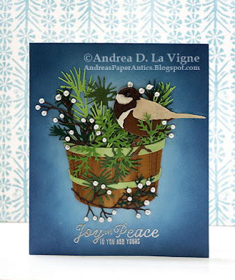
Joy and Peace


This has been the second week of the September challenges at Christmas Card Throwdown. This challenge is a color challenge to use green, brown, & blue. I admittedly struggled a bit, not so much because it's a difficult color combo (I don't think it is), but just trying to decide how I wanted to incorporate those colors into a card. Plus, trying to get into the holiday card making mentality. But, it's the second week of September, & the holidays will be here before we know it. So I decided to take the plunge & get making! :)


My design inspiration came from a home decor piece we have that is a bird sitting in a basket, surrounded by an autumnal arrangement of greenery & fruit. I decided to create something similar with a more wintry feel. For the basket, I chose Concord & 9th's "Freshly Picked" die set. The bird came from Honey Bee Stamps' "Lovely Layers: Winter Birds" die set, & the foliage from Sizzix/Tim Holtz's "Holiday Greens" die set. I pulled the greeting from the October 2020 My Monthly Hero Kit from Hero Arts (discontinued). 

I chose a few different shades of brown cardstock from my scrap stash for the bird. I die cut the pieces,  & then used liquid glue to assemble the bird. Instead of die cutting the beak & eye, since they are so tiny, I used a black pen to color in the beak & added the eye with Ebony Black Nuvo Crystal Drops.

I die cut the greenery from an assortment of green cardstocks - also from my scrap stash. I used kraft cardstock to die cut the base pieces for the basket, & a pale green for the bands. For the berry branches, I used dark brown cardstock. I'm happy to say, except for the card front panel, I actually used only scraps for all the elements!

For the basket, I used Gathered Twigs Distress ink to shade both of the kraft pieces. I added additional shading to the edges of the back piece with Walnut Stain Distress ink, & used Bundled Sage to shade the green bands. Finally, I glued all the pieces together. I arranged my greenery & berry branches in the basket, gluing them to the back of the basket as I went. After I had a few greenery pieces glued in place, I went ahead & added my bird so I could better integrate him into the arrangement. Finally, I glued one branch & a green sprig to the front of the basket.

I had initially intended to make this an A2-size card, but when I laid my completed basket arrangement on a panel, I quickly realized I had to upsize! I cut a 5x7" panel from light blue cardstock, but decided that was a bit too tall, so I cut it 1" shorter, to a final size of 5x6". I ink blended around the outside of the blue panel with Faded Jeans Distress ink, then added Chipped Sapphire around the very edges to darken that area up. I left the middle with no ink, to create a glowing effect around my focal point.

After I finished ink blending & adhered my card front to a white card base, I glued down my arrangement. I struggled with the placement a bit, since if I centered the whole piece - measuring from the end of the bird's tail on the right to the edge of the greenery on the other side, the basket itself was off-center. I finally just kind of "fudged" it a bit, so that while nothing is perfectly centered, it still looks balanced. Then I added the berries with Ivory Seashell Nuvo Crystal Drops. I let all that dry overnight, and finished by heat embossing my greeting with Ranger Silver Super Fine Detail embossing powder.

I'm also entering this card in the following challenges:

The Paper Funday Challenges #57: "Anything Goes" (not playing the optional twist)